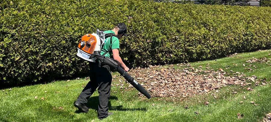
This hero is built with a flex layout, aligned and justified so that the content will always be centered horizontally and vertically. To change this section’s background, select the “Hero Overlay” then scroll to the background section of the Style panel and replace the image. You can also adjust the opacity of the overlay’s black background for better contrast.
The feature layout is built with flex, like the hero layout. Don’t like our typesetting? You can update every detail in the typography section of the Style panel.
You can also add spacing between the heading and paragraph, swap a video in for the image, or add a button. Just make sure to drop your button into the div block that contains this content.
Use these cards when you want to display content with an image, such as a blog post or product. They’re built with CSS grid to enable the 3-column layout. When you select the “Cards Grid Container,” you’ll see a red icon on the top right. Click the icon to edit the number of columns, the column gap, and more!
The card images have fit set to cover, so they fill their masking container without stretching. Try making the “Cards Image Mask” a circle using border-radius or adjusting the size ratio using top padding. Don’t forget to set an alt description for each image, which will help with accessibility.
Lorem ipsum dolor sit amet, consectetur adipiscing elit. Suspendisse varius enim in eros elementum tristique.
This form uses grid for its layout. Adjust and reorganize the divs inside the Form Grid to fit 1 or 2 grid columns as needed.